Is Individual Podcast Episode Artwork Worth The Effort?
If you’ve been podcasting for a while, you may remember when Apple Podcasts announced this “podcast episode artwork” functionality back in 2023. The idea was that in addition to your overall podcast artwork, you could upload a separate 3000×3000 pixel thumbnail image for each new episode.
Sounds great, right?
At the time, I was worried that this was just Apple Podcast’s way of turning into YouTube, and I’ll admit that I had split opinions on the point of this new feature.
Table of Contents
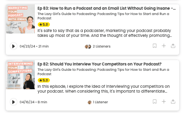
On the one hand, having individual podcast episode world would then show up as a little visual preview whenever someone browses your podcast feed on Apple Podcasts or other directories that support episodic thumbnails.
At the time, I was pretty intrigued by the concept. As someone who consumes a lot of content myself, I know I’m often drawn to eye-catching thumbnails when scrolling through videos or podcasts. Sometimes an interesting visual can pique my interest in a way that a basic title can’t.
So when Apple added this YouTube-esque functionality to podcasting, part of me thought “Hey, this could be a cool way to visually grab potential listeners and entice them to check out my episodes!”
The other part of me, however, felt a little skeptical. Isn’t this just podcasting trying a bit too hard to be like YouTube?
Podcasting is an audio-first medium. Did we really need to prioritize crafting custom visuals for every single episode?
After bouncing back and forth, I decided to lean into the episodic thumbnail trend and give it a legitimate try for my own podcast, The Lazy Girl’s Guide to Podcasting. That was over 60 episodes ago now.
For the vast majority of those 60+ episodes, I’ve diligently created a unique thumbnail image to go along with each new release. I’ll fully admit that there have been a few episodes here and there when life got too crazy and I punted on making a custom thumbnail. In those cases, it just defaulted to my regular podcast artwork.
But for the most part, I’ve stuck to making these creative visuals a part of my podcast workflow. I even went back and made thumbnails for some older episodes in my catalogue.
So after devoting all this time and effort to episodic thumbnails for nearly a year, what’s the verdict? Has it actually helped grow my audience and drive more listeners to my podcast?
The honest answer? Well, it’s complicated. So, let’s dive in.
What is Individual Podcast Artwork?
Individual podcast episode artwork, also known as episodic thumbnails or episodic artwork, refers to creating a unique visual image for each new episode of your podcast.
It’s similar to how YouTube creators make custom thumbnail images to represent every new video they publish.
Rather than just having a single overall artwork image for your podcast feed, episodic artwork allows you to upload a separate square image (3000×3000 pixels) for each episode. This individual image then shows up as a visual preview whenever someone browses through your list of episodes on podcast apps and directories that support this functionality.
Benefits of Using Individual Podcast Episode Artwork
- Visual appeal – Having an eye-catching image can make your episodes stand out more when people are scrolling through podcast feeds, potentially grabbing their attention better than just a text title alone.
- Branding/recognition – Consistent use of branded episode artwork can help create stronger visual associations with your podcast over time as people see the thumbnails repeatedly.
- Conveying topics – The artwork lets you visually convey the topic or theme of a particular episode at a glance through imagery.
- Driving clicks – Compelling visuals may entice more people to actually click and check out your episode descriptions when browsing.
- Setting expectations – Artwork can set the tone for an episode, giving listeners a visual hint about whether it will be serious, funny, narrative-driven, etc.
- Multimedia experience – For listeners who view your episodes on video platforms, custom artwork enhances the overall multimedia experience.
- Professional look – Having unique artwork per episode can make your podcast appear more professional and polished.
- Standing out – As more podcasters adopt episodic artwork, not using it could make your show look outdated or less engaging by comparison.
So in summary, while not absolutely essential, incorporating individual episode artwork can be a way to potentially increase visual appeal, differentiation and audience engagement for your podcast.
Which Podcast Directories Support Individual Podcast Episode Artwork?
Here are just some of the major podcast directories and apps that currently support displaying individual episode artwork or episodic thumbnails:
- Apple Podcasts
- Spotify
- Google Podcasts (remember, they’re shutting down in 2024! Read more about that here >> The Rise and Fall of Google Podcasts: Why Google Podcasts is Shutting Down)
- Overcast
- Pocket Casts
- RadioPublic
- Podchaser
- Amazon Music
- Goodpods
There are also some other smaller podcast apps and web-based players that may display episodic thumbnails if provided in the podcast’s feed. However, the main directories listed above are currently the biggest platforms supporting and showcasing this artwork functionality.
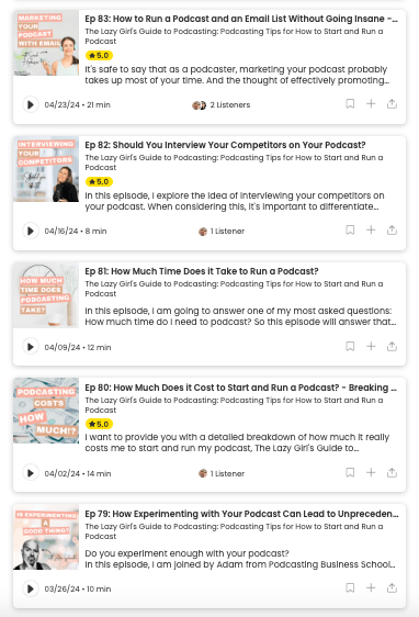
It’s worth noting that not all podcast-listening apps and directories have adopted episodic thumbnails yet. Some still only show the overall podcast artwork across all episodes. But, the major players have embraced it as a way to give podcasts more visual expression.
Related post >> Podcast Distribution: Why Your Podcast NEEDS to Be Everywhere
My Experience with Podcast Episode Artwork
While my downloads have steadily increased since last August, I can’t point to the episodic thumbnails as the key driver of that growth. In reality, a bunch of different factors were likely at play.
For example, The Lazy Girl’s Guide to Podcasting was still a pretty new podcast back in August 2023 when I first became aware of podcast episode artwork. In fact, the podcast had only been around for about 4 months at that point. So it makes sense that I’d continue seeing download growth in the months after that, simply from gaining more exposure over time.
An even bigger factor, though, to my podcast growth than introducing podcast episode artwork, was when I switched my podcast host to CaptivateFM in January 2024. They have awesome growth tools that helped me get my content in front of more people in my target audience. That podcast host change definitely played a bigger role in supercharging my downloads than any fun thumbnail images.

From studying my analytics, I’ve also realized things like my social media strategy impact downloads way more than visuals.
For example, I used to put a lot of effort into promoting my podcast on Instagram, but then realized it wasn’t actually driving much traffic. Switching to focus more on Twitter has paid way bigger dividends.
The same goes for posting regular blog content and linking back to my podcast episodes. That’s been a solid source of new listeners too.
But when I look at all of these different growth levers I’ve pulled – new hosting platform, doubling down on Twitter, publishing blog posts, etc. – nowhere does it seem like the episodic thumbnails themselves moved the needle in any significant way.
Now, to be fully transparent, it’s an imperfect analysis. I haven’t run any true A/B tests where I publish one episode with a thumbnail and one without, then compared the differences. And I haven’t stopped doing episodic thumbnails to see if it impacts things.
I’ve just been making these visuals consistently as part of my overall podcast workflow. So it’s tough to isolate their precise impact.
But still, if they were truly a massive driver of new audience growth, you’d think I would see a more obvious correlation between starting episodic thumbnails and a spike in downloads, right? From what I can tell, though, that hasn’t been the case.
Which brings me to the big question: Given all that, do I actually think these episodic thumbnails are worth the time and effort for podcasters?
Here’s my take – if you genuinely enjoy making these visual assets and have the bandwidth to incorporate it smoothly into your workflow, then go for it! There’s no real downside other than your time investment.
Personally, while I can’t say they’ve massively accelerated my podcast’s growth so far, I still find value in making them for a few reasons:
- I’m a visual person, and I enjoy the challenge of creating podcast episode artwork that will entice potential listeners to hit ‘play’ on a podcast episode.
- It creates a consistent, cohesive brand experience across all my episodes. Even if it doesn’t drive a ton of new listeners, it cultivates a polished, professional look for my existing audience.
- Let’s be honest – the vast majority of podcast players and directories still don’t actually display episodic thumbnails anyway. But for those that do, like Apple Podcasts, it gives my show an engaging visual touch point.
- You just never know – maybe down the road these thumbnails will start making more of a difference as the technology and user behavior evolves. I’d rather already be embracing it.
- My YouTube channel is hooked up to my podcast’s RSS feed, meaning that the podcast episode artwork serves as a YouTube thumbnail when a new podcast episode is published. Sure the system isn’t foolproof; the artwork is 3000×3000 px rather than YouTube’s thumbnail sizes, but it’s better than nothing when you’ve got a ton of other post-production tasks to get through.
Final Thoughts on Podcast Episode Artwork
For me personally, podcast episodic artwork has become an ingrained part of my podcast process that I plan to continue. Sure, there are definitely weeks when I’m stretched for time and don’t create a new thumbnail image. But for the most part, I try to stick with it.
That said, I’m also very aware that not every podcaster has the same post-production time as me. We all have to prioritize where we spend our time and creative energy based on what moves the needle for our own shows.
If you’ve experimented with episodic thumbnails for a while and genuinely aren’t seeing any positive returns in terms of marketing impact or audience growth, then I can totally understand deciding it’s not worth the effort for you. Don’t force yourself to add it to your workflow just because some platforms offer the feature.
At the end of the day, podcasting is primarily an audio medium. As long as you’re consistently putting out high-quality content that serves your audience, that’s what matters most. Visuals can be a nice supplementary touch, but they shouldn’t distract from your core focus of creating great audio material.
What’s your experience been with these YouTube-esque episodic thumbnails? Have you seen them actually drive more listens and audience growth? Or do you fall more in the “waste of time” camp when it comes to podcasting?


